Take a moment to consider what device are you reading this on. Is it your work laptop? Home desktop? Maybe you’re thumbing through this page smartphone in hand?
If you are reading from a smartphone or mobile device, you probably noticed that you didn’t have to endure the painful, tedious process of pinch zooming, panning, double tapping, swiping, and scrolling to adapt this page so it is manageable to read. You’re welcome.
Trying to master these pesky magnification gestures is like trying to translate some bizarre dialect of technological sign language just to communicate with your mobile device. To say the least, these touch sensitive commands are quickly becoming a touchy subject for your customers. The good news is that there is something you can do to alleviate the infuriation and thinning patience your visitors are subjected to when they view your website.
What is Responsive Design?
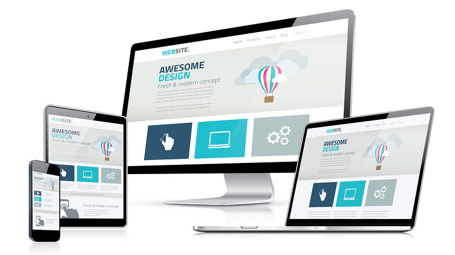
Responsive design simply allows webpages to respond to the size of the screen or browser they are being viewed on. Basically, a responsive website adapts to its environment, rather than the user having to adapt to it. For example, an iPhone, tablet, Kindle, laptop, etc. will all display the glorious spectacle of a consistent, easy-to-navigate website. No technological sign language required. It’s a no brainer that responsive websites provide a better user experience, but there’s a myriad of other benefits to be reaped by sowing the magic seed of responsive design.
Why Do I Need Responsive Design?
According to StatCounter, an independent web analytics company, Internet usage by mobile devices exceeded desktop usage worldwide for the first time ever in 2016. Needless to say, a lot of emphasis is being made on updating websites to be mobile friendly and responsive design is the key that unlocks this domain. If you’re still apprehensive about taking the plunge with responsive design, check out these three reasons to dive in headfirst:
Google Said So
Google favors mobile friendly websites and prioritizes them in search algorithms, saying, “We’d reeeeeeally love if you all did this… wink wink, hint hint, nudge nudge.” Since the big G brings your website more traffic than any other source, it’s best to give Google what it wants and you will be amply rewarded. This is a symbiotic relationship you don’t want to break up. Even if your website is chock full of amazing content that’s updated regularly, without responsive design, Google will lower your ranking.
Customers Say So
In today’s saturated market, user experience has the ability to make or break potential business opportunities. If your website is not built with responsive design, it’s likely the only response your visitors will have is hitting the back button. Customers can be lost just as quickly as their attention gained when you don’t offer a pleasant mobile user experience. Your website is your first impression and if customers can’t navigate your website effortlessly, they won’t think twice about jumping into the arms of a competitor.
‘Future You’ Says So
Responsive website design is a solution for today, tomorrow, and many years to come. As technology continues to change at breakneck speed, responsive design keeps right in stride. It meets the needs of all browsers, all devices, and all screen sizes. Other technologies depend entirely on today’s standards, setting themselves up for obsoletion. With not only the speed to stay in step with the technological revolution, responsive design also has the endurance to persevere through the changing times and save you time, energy, and money in the future.
So now that you’ve decided to heed to the sage advice from these movers and shakers and you know what responsive design is and why your website needs it, take the Mobile-Friendly Test to see how your website stacks up. You can test a single page or your whole website to see how easily a visitor can use your page on a mobile device and understand exactly what Google’s search algorithm is looking for. If your website isn’t up to snuff, Net Designs is well versed in building websites that present beautifully, no matter what size the screen. Visit our Contact page and let’s start a conversation!
Author: Kendall Dick, Net Designs Blogger
Net Designs, Wendy Bedell | (269) 428-5016 | wendy.bedell@netdesignsonline.com | Contact